Every team on the 2024 F1 grid has now revealed their cars, bringing the start of the season tantalizingly close—you can almost hear the Dutch national anthem already. But before we get there, there’s one crucial task left: ranking how cool each car looks, from best to worst.
This is, of course, a highly scientific process. We crunched the numbers, set up a wind tunnel, donned lab coats, and spent some quality time scrutinizing photos of the new cars on our phones. So, here it is—the definitive ranking of the 2024 F1 grid’s aesthetic appeal. Spoiler alert: it’s not great news for Red Bull.

10: Stake F1 Team Kick Sauber C44
A new color scheme and a rebrand for the team formerly known as Sauber has brought us the Stake F1 Team—though the name feels more like a tabloid headline (“Stake F1 Team does what?”). Unfortunately, it’s also the worst livery on this year’s grid.
Why? In a paddock where most teams have embraced nearly identical blackout liveries, this design misses the mark by failing to reflect the team’s heritage. Instead, it looks more like a custom team you created in an F1 game on your PS5 before losing interest halfway through the season.
We’re not opposed to exposed carbon or that vivid shade of energy drink green, but in this particular setup, it gives off vibes more akin to a villain from a Pixar F1 movie.

9: Haas VF-24
They’re trying, no doubt. There’s nothing particularly wrong with Haas’ slightly tweaked livery featuring a huge, stenciled “HAAS” on the sidepods. However, much like their endless re-signing of Kevin Magnussen, it lacks a bit of ambition.
The design also gets lost in this year’s trend of mostly black liveries. If not for the fact that they’ll likely be trailing by 30 seconds, it would be tough for commentators to distinguish these cars from the McLarens, Mercedes, and Alpines at a quick glance.

8: Red Bull RB20
Nobody expected that it would suddenly be bright orange, or that it wouldn’t once again feature everyone’s favourite taurine-fuelled bovine emblazoned over the engine cover. Red Bull’s had a look since it entered the sport in 2005, and it’s largely stuck to it. However: come on now. What is this?
It’s a livery that somehow manages to simultaneously appear as though nothing’s changed since last year, and look even more boring. The team probably has better things to concern itself with than how drippy the livery is on the car that will win each and every race like a toddler who hasn’t learned to share, but the fact remains that this is as boring as watching a Friday practice session at the defunct Valencia street circuit while sitting next to an evangelical crossfit enthusiast.

7: Williams FW46
Williams has opted for a blue livery this year.
There’s not much more to add. It’s a nice, classic blue, similar to last year’s design, but updated with the obligatory black carbon sections to comply with the 2024 regulations. We’re far from the days of the iconic Martini liveries.
Still, there’s a Williams on the grid, and it might make it to Q3 a few times under Albon’s skilled driving. Of course, that success won’t have much to do with the design of this blue-and-black livery, but motorsport isn’t always about aesthetics. And on the topic of blue and black liveries, let’s welcome…

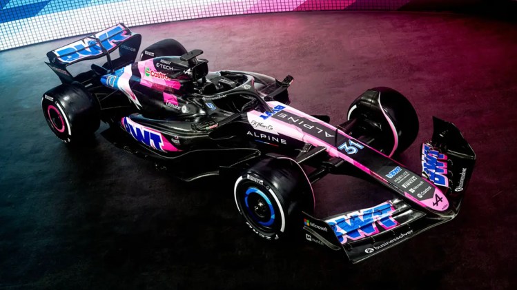
6: Alpine A524
You can imagine the disappointment for Pat Fry and his team when they saw everyone else unveil their similar liveries in February. This one, however, stands out with its aesthetic contrast. It gives the impression that the car is moving so quickly that some of the paint has chipped away. The sponsors and splashes of color clearly identify it as an Alpine, but in a deconstructed and appealing manner. While it’s not as striking as the 2021 A521, which was arguably the best livery in recent years, it’s still decent.
Unfortunately, all the other black liveries emerged and overshadowed Alpine’s design. What a selfish move! Five-second penalty for Ocon.

5: Visa Cash App RB 01
Even though it’s named Visa Cash App RB this year—a name that feels more like an insult than a title—there’s plenty to appreciate about Toro Rosso Alpha Tauri Baby Red Bull’s livery.
The contrasting color lines beautifully complement the swooping design of the sidepods. The diagonal splash of color between the front wheels and the halo on the monocoque adds to the cohesive look. Everything seems to work in harmony, creating the impression that the car’s speed has caused the colors to streak out in attractive angles.
While it does lose some points for resembling the Toro Rosso designs from 2017-2019, it gains back at least as many by maintaining a colorful appearance, providing our tired eyes with a refreshing visual this year.

4: Aston Martin AMR24
Similar to last year, the blend of elegant, classic racing green with vibrant fluorescent yellow accents is highly effective. It gives the impression of a team that has been part of F1 for decades.
The delicate yellow piping is strategically placed to highlight the curved parallel lines along the side of the car, creating the illusion of slicing through the air. This is likely how Adrian Newey perceives a car in motion with his own eyes.

3: Mercedes W15
Yes, it’s yet another black car from the team famously known as the [checks notes] Silver Arrows. However, this black car closely resembles the one that achieved a dominant drivers’ and constructors’ double in 2020, highlighting the importance of heritage in F1.
To be fair to Toto’s team, this year’s design incorporates significantly less black than last year’s. When viewed from the front, it evokes memories of Lewis Hamilton’s remarkable 2014-2019 run with the old silver liveries. Additionally, the tidy red Ineos sponsor logo along the air intake provides a striking contrast to the otherwise muted color scheme.
It’s still a bit hard to accept that Lewis Hamilton won’t be driving this car next year. Could we expect a completely new look for Mercedes’ 2025 livery, similar to Repsol Honda’s bold redesign for 2024 in light of Marc Marquez’s departure after more than a decade?

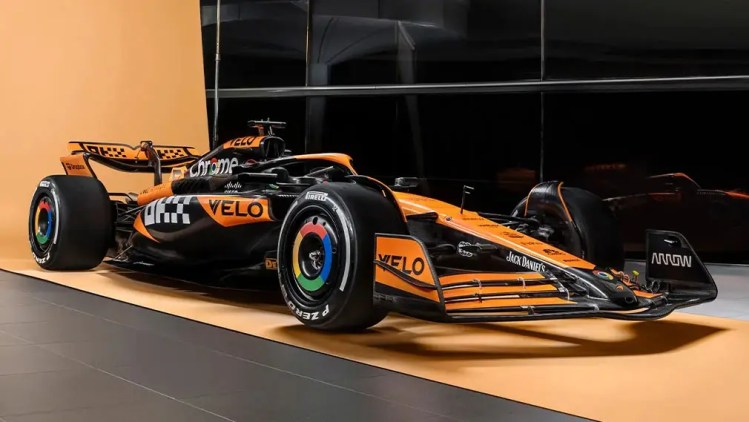
2: McLaren MCL38
In the mid-2010s, the Honda-powered McLarens seemed to be boldly challenging viewers to find any excitement in their designs. However, when the Woking team switched back to their signature papaya orange, they appeared to gain an extra second per lap. Is it possible that “some colors weigh more than others” holds some truth?
This year’s McLaren also benefits from some particularly stylish sponsor decals. The return of the Google Chrome logos on the wheel rim covers is a clever touch, while main sponsor OKX’s pixelated font effectively conveys the team’s appeal to Gen Z. Aside from attaching a North Face jacket to the rear wing, nothing says youthful more than a crypto sponsor with a gamer-inspired logo on an F1 car.

1: Ferrari SF-24
Ah, the sweet embrace of color. Thank you, Maranello, for ensuring that at least one team stands out in 2024. The SF-24 is once again adorned in the classic rosso corsa, a hue synonymous with the sport since its inception, complemented by a tasteful arrangement of sponsors that enhance its appearance. The added touches of white and yellow evoke the special tribute liveries showcased at Monza last year, and they work just as effectively here as they did in 2023.
Will this somewhat arbitrary livery ranking be the only victory for Scuderia in 2024? It’s certainly a possibility. But if they’re destined to finish as runners-up in a lackluster procession behind an energy drink company for all 24 races, they might as well do it with style.

